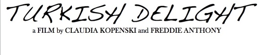
Poster Development:
On this page, i will be explaining the process of my short film 'Turkish Delights' poster. Here i will be commenting on the different fonts, coloring and images i have experimented with and why i have chosen the final design of my two final posters. Furthermore i will be commenting on how other poster designs have influenced my poster development.
AIM'S FOR POSTER:
The aims i had when creating the poster were too introduce my leading character to the audience, almost relying on his face to sell the movie. In addition to this i wanted the different fonts and colors used to attract specific audiences. I wanted the comedic genre of 'Turkish Delight' to be noticeable but also add some mystery to the genre of the film itself, leaving audiences questioning whether it is only a comedy, or if there is something darker to the film itself. My intentions were to aim for and attract two audiences, the older, 'Art House' members and a teenage/young adult audience.
I initially wanted to create two separate posters which featured the actors face (something which i kept for the two final posters). I began with four photos in consideration for my poster:
The first image, although comedic gave too much of an obvious sarcastic stare wich i found to be to predictable of the films plot itself. Furthermore, i felt that the image was not as comedic as it could be compared to the other three.

This second image, although more outwardly comedic, i felt did not posses the 'endearing' quality i wanted to achieve, and therefore distanced itself for the other audience i wanted to appeal to. It seemingly only would attract the teenage/young adult audience.
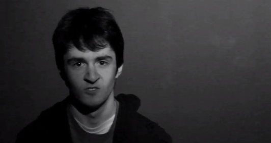
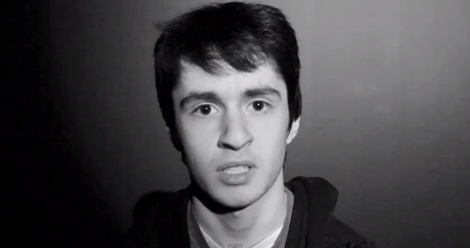
I found this image more suitable as it would appeal to both audiences i was aiming for, his facial expression leaves questions and has undertones of both comedy and a darkness. This clash leaving the genre almost uncertain.

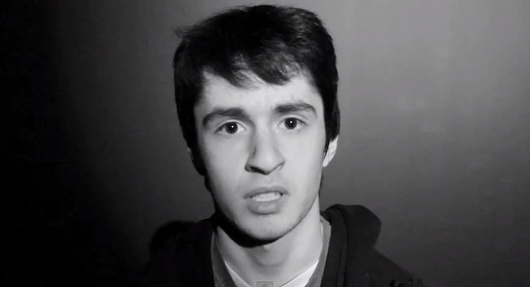
I felt that this photo fully captured comedy through the expression, furthermore his smile itself is comedic yet devious immediately insinuating a clash in genre. The image itself also seems more audience friendly, in terms of appealing to both audiences i wanted to aim my film at.
Taking these two images i experimented with color, font and layout:
POSTER 1: Coloring
POSTER 1: Coloring

Although directly linking to the comedic element of our film and the flamboyant and bizarre nature of our character, i felt this color to be slightly to subdued as well us almost to unusual for a film poster. Furthermore, it did not seem to represent the institution we had wanted our film to released by, 'The Weinstein Company'. Although the color does in fact almost contradict the overall, complete genre and leave audiences attempting to guess the content itself, i felt it to be too farfetched from my original vision for the film poster. In addition to this the color somewhat barricades the attraction for an older, more 'Art House' audience, furthermore, it seemingly 'stereotypically' would not appeal to all teenagers and the color is stereotypically something which girls tend to be more attracted to.

Similarly to my comments on the poster above, i felt that although this color was brighter and more eye catching it was too far away from the overall film topic and made the poster itself seem to represent a romantic comedy rather than a hybrid black comedy. It also did not posses that endearing quality that the picture itself had originally conveyed.

This color i felt was too 'rusty' and made the poster itself seem far too obvious due to the connotations the color red has (blood etc..). I also felt that this color was not flamboyant or bizarre enough to fully represent our character true personality and instead it made 'Muslim Boy' appear to be demented and altogether creepy, this leaving no interpretation or questioning for audiences.

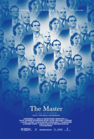
This color wash proved to be the right choice for the film poster as the color itself remained eye catching and usual, yet held somewhat of a subdued quality to it. The color itself did not alter the picture in any way, it did not make the 'scenario' and happier or sadder than it should be and left audiences looking at the poster up for discussion and interpretation on the genre of the film and what the color scheme and photograph used mean and represent. Although poster 1 was mainly looking to attract older/'Art House' audiences, the teal color itself somewhat works at also attracting those of a younger generation to, the color itself is also seemingly gender neutral. I found that when considering this color, it resembled the background color used on the recent Academy Award nominated 'Weinstein Company' film 'The Master'. This furthered my decision on believing that this color was an appropriate choice as 'The Weinstein Company' is one that we had planned to 'market' our film to be released by.
Below is the poster of 'The Weinstein Company' film 'The Master'.
POSTER 1: FONT & LAYOUT
Picking the fonts for the poster was crucial as it was what separated the poster from looking ametur to professional. In addition to this the font needed to accurately convey a part of the story/character within it allowing audiences to think about the connotations behind the choice of font and what it means.
Although this font aesthetically appears sleek and professional, i felt that it was a font suited to a film of the sci-fi/thriller genre and was to 'put together' to represent our Black Comedic, dry short film.
Although the handwritten effect of the writing proved effective in attempting to represent the character of the teenage boy, this writing visually seemed too 'artistic' to represent our film's plot and character itself. The font also seemed extremely feminine (stereotypically) and i felt it did not convey the character strongly.
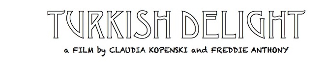
This font proved to be most appropriate. It includes a handwritten effect in the font below the title, therefore keeping the idea of representing how a teenage boys handwriting would stereotypically be imagined, this immediately linking the the photo of our character on the poster itself. The font used for the title 'Turkish Delight' proved to be the perfect font for representing our film. Our lead character 'Muslim Boy' is a Turkish Muslim, and this almost ethnic font clearly alludes to a cultural undertone which would seemingly carry throughout the film, we felt that this perfectly represented our lead character subtly and also worked well with the visual appearance of our actor on the poster, who possess dark features.
POSTER 2: COLORING

Although this color is fully representative of the institution 'The Weinstein Company', almost mirroring that color scheme of the recently Academy Award nominated film ('The Master') released by this company. I felt it to be too similar to my first posters teal wash. I wanted to approach this poster differently giving it an edgier more teenage/young adult directer effect in order to create a balance, as poster 1 attracts more of an older/'Art House' audience.
The use of only Black and White coloring within the picture for the poster proved effective as it is much simpler than poster 1, immediately appealing to younger audience due to the simplicity. Furthermore, the use of this coloring leaves the film itself with an edgier more current effect which also would reel in those of a younger generation.
POSTER 2: FONT & LAYOUT
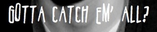
Although i did want to keep the same font used in poster 1, i did chose to include another font for a phrase on the poster itself 'gotta catch em all'. In order to find a handwritten font that was appropriate for the poster, yet different from the font i had already used, i searched on the online website 'dafont.com' where i was able to download a new handwritten font. The style of this handwritten font also added a slightly 'creepier' than the others did, through this i was also able to subtly convey the darker side of the character and the plot, this was furthered by the use of black and white instead of bright or unusual colors.
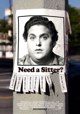
Originally for the layout for poster 2, i had intended to use a similar layout to the one seen on the final poster 1. However i felt that this made them look far to similar, in order to make them slightly different i began to research poster of recent, popular comedy films. Upon research i came upon the poster of 'The Sitter' starring Jonah Hill, although not produced by 'The Weinstein Company' the poster itself provided the flair and 'current' element i wished to convey aesthetically in this poster. I also found that the image of the leading actor in fact resembled the facial expression of my own actors. Taking the idea of the rhetorical question used on the poster i implement the phrase 'Gotta catch em all?' onto my own film poster.
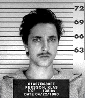
I decided to cover my characters eyes with the title to add a sense of mystery that was lacking in poster one. This mystery furthered the 'current' element i wanted to convey, as well as acting to attract a younger audience. The use of it covering my lead characters eyes also resembled the plaques held during a mug shot. This almost acting as a premonition and possibly a sequel to the plot within our film.
The software used to create both posters was Microsoft Powerpoint, all fonts apart from the on mentioned above were found on the Microsoft Powerpoint Tool Bar page. The additional font was found on the free downloadable website 'www.dafont.com'.
