Poster Analysis 1: 'Amelie' by Jean-Pierre Jeunet
Below is my poster analysis for the film 'Amelie':
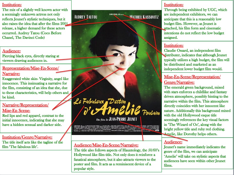
What have i learnt & how will it influence my own films poster:
Through analyzing this poster i have specifically noticed how use of color and font can affect the way the genre of a film is perceived. In addition, i have noticed how the names which are shown on a poster itself can affect audiences immediate opinions and ideas about the films genre, story and much more.
Looking at the coloring of this poster, for my own film 'Turkish Delight's poster i intend to use slightly unusual poster coloring. In addition to this i would like to chose specific fonts which represent the genre and overall ambience of 'Turkish Delight', much like the fonts choices within this poster.
Looking at the coloring of this poster, for my own film 'Turkish Delight's poster i intend to use slightly unusual poster coloring. In addition to this i would like to chose specific fonts which represent the genre and overall ambience of 'Turkish Delight', much like the fonts choices within this poster.
