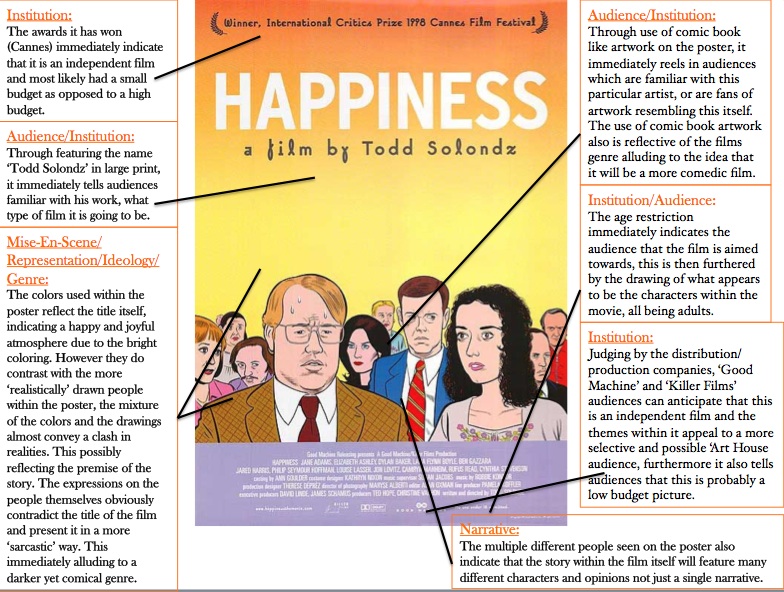
Poster analysis 2: 'Happiness' by Todd Solondz
Below is my analysis of the poster for the feature film 'Happiness'.
What have i learnt & how will it influence my own films poster:
Through analyzing this poster in particular, i discovered how the use of font and imagery can contrast to or follow the meaning behind the title. Like the 'Happiness' poster, i intend to create a poster that has a photograph which contrasts to the title, in addition to this, creating another poster that follows the title exactly. Furthermore, the use of handwritten/comic book font on the title appeal to a wide range of audiences, even if the films content is not suitable for all, this is also something i would like to include on my own posters for my short film 'Turkish Delight'.
