Poster analysis 3: 'Mean Girls' by Mark Walters
Below is my poster analysis of the poster of the film 'Mean Girls'.
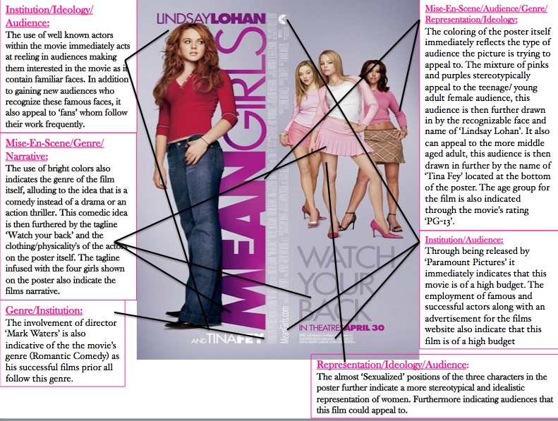
What have i learnt & how will it influence my own films poster:
This poster is possibly the most predictable poster of the three, the coloring and imagery suit the films plot exactly and indicate clearly the genre/characters and audiences. Although visually appealing and overall an excellent and clear poster for the film, after analyzing, i found that for my own poster i would like their to be a sense of 'mystery' left for audiences and use colors that are slightly unexpected and images that are not necessarily expected to be seen on a film poster. I would ideally like to have the poster leave them still guessing the definite genre of the film. In addition to this the use of 'hollywood' names on the poster have inspired me to possibly include 'awards' from prestigious award ceremonies such as 'Cannes' and 'The Academy Awards' to subtly do as this poster has done and draw audiences in.
